How to read a share price listing
A share price listing is a compact market snapshot. Learn what price, spread, volume, yield and P/E mean before placing a trade.
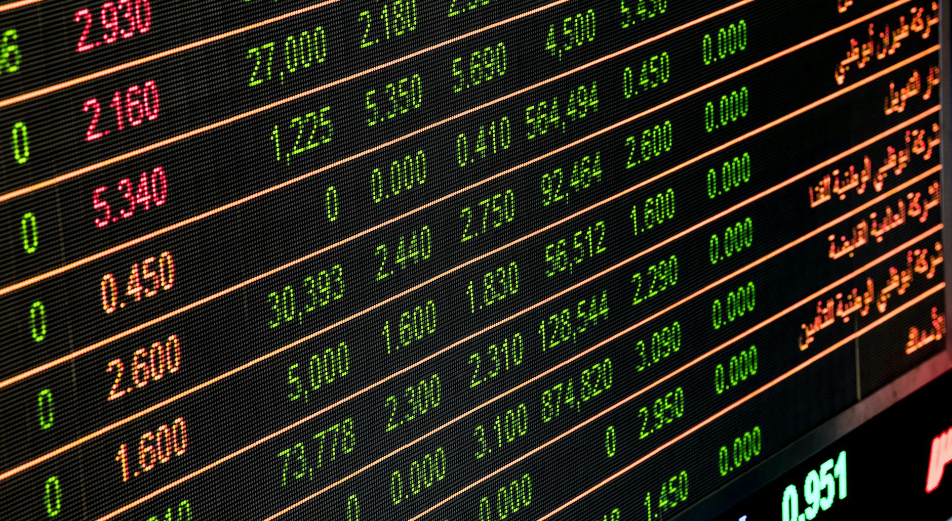
A share price listing looks like a wall of numbers until you know what each number is trying to tell you. Once you can read it, the screen becomes much less noisy.
The Short Version
- A share price listing shows the latest market price, daily move, spread, volume and common valuation numbers.
- UK shares are often quoted in pence, not pounds, which catches many beginners.
- The bid and offer spread tells you the real dealing cost before platform fees.
- No single number is enough. Read price, volume, yield and valuation together.
What a share price listing shows
A share price listing is the compact screen beside a company name on a broker, app or finance website. It gives you a fast view of what the market is doing.
The London Stock Exchange guide to share prices explains the basic force behind the number. Buyers and sellers meet, and the price moves when supply and demand change.
A share price listing is not a full investment case. It is a dashboard. It helps you decide what to check next before you trade.
Start with the quoted price
The biggest number is usually the latest traded price. On many UK screens it is shown in pence, so 297.40 means 297.40p, not GBP 297.40.
That detail matters. A beginner who mistakes pence for pounds can misread the size of a position before they have even looked at the company.
The price also needs context. A 5p move in a 50p share is very different from a 5p move in a 500p share.
Read the daily change carefully
Most screens show the daily change as a number and a percentage. The percentage is usually more useful because it scales the move.
A share down 2 percent has moved the same in percentage terms whether the price is 50p or 500p. The cash move alone can mislead.
The daily change also depends on the starting point. One strong or weak session does not tell you what the business is worth.
This is where patience helps. Compare the move with news, normal trading range and wider market conditions.
The bid and offer spread matters
The bid is the price buyers are currently willing to pay. The offer is the price sellers are currently asking for.
The gap between them is the spread. It is a real cost because you usually buy near the offer and sell near the bid.
A tight spread can make trading cheaper. A wide spread can make a trade expensive before the share has moved at all.
Our guide to investment costs explains why dealing fees, platform costs and spreads all matter together.
Volume shows how busy the market is
Volume tells you how many shares have traded during the period shown. It helps you judge whether a price move has much activity behind it.
A sharp rise on heavy volume can mean more buyers are active. A sharp rise on tiny volume may be less reliable.
In smaller companies, volume can change the whole story. A few trades can move the price when there are not many buyers and sellers.
The post on market makers explains why liquidity shapes the prices private investors see.
Yield and P/E need context
Dividend yield compares the annual dividend with the share price. A high yield can look attractive, but it can also signal that the market doubts the dividend will last.
The P/E ratio compares the share price with earnings per share. It is a quick valuation measure, not a verdict.
Our guide to P/E ratios explains why low is not always cheap and high is not always expensive.
Read these numbers with the business model, debt, profit trend and cash flow. A share price listing gives clues, not answers.
A Worked Example
Imagine a UK share is quoted at 250p, up 10p on the day. The screen also shows a 4 percent move, a bid of 249p and an offer of 251p.
The percentage tells you the move is meaningful for that share. The spread tells you the immediate dealing cost is about 2p before platform fees.
Now add volume. If volume is far above normal, the move may be linked to news or a larger buyer.
If volume is tiny, the price may have moved because the market is thin. That does not make the move false, but it makes it less useful on its own.
Finally, check yield and P/E. If the yield is high and the P/E is low, ask why the market is cautious before assuming the share is cheap.
The checks to make before you trade
First, confirm the currency and unit. UK shares may be quoted in pence, while overseas shares may be quoted in dollars or euros.
Second, check the spread. A wide spread can make small trades harder to manage.
Third, check volume. You want to know whether the price is moving in a busy market or a thin one.
Fourth, check the latest RNS or company news. A price move without context can be a poor reason to trade.
A share price listing works best when you treat it as a checklist, not a signal. The screen can point you towards useful questions, but it cannot answer whether the business deserves your money or whether the risk suits you.
The FCA investing quiz is a useful reminder that confidence can run ahead of understanding. A share price listing should slow you down, not rush you.
What This Means For You
A share price listing helps you ask better first questions. It does not tell you whether a company is good, bad, cheap or expensive by itself.
Use the screen to spot what needs checking. Price, spread, volume, yield and valuation each answer a different question.
Our guide to how the stock market works gives the wider background. The post on risk and reward explains why the numbers must fit your own limits.
The best habit is to pause before pressing buy or sell. If you cannot explain the main numbers on the screen, you are not ready to act on them. That pause is part of good investing hygiene.
In Plain English
A share price listing is a quick market summary for one company. It shows the latest price and several clues about trading, cost and valuation.
The price tells you where the last trade happened. The spread tells you the gap between buyers and sellers.
Volume tells you how active the market is. Yield and P/E give rough valuation clues, but both can mislead without context.
Read the screen as a starting point. Then check the company, the news, the costs and the risk before making any decision.
This article is for general financial education only. It is not financial advice or personal investment advice. Investments can fall as well as rise, and you may get back less than you invest.